

Isaiah 9:6 Interactive Art (Guest Post)
imageTitle
Isaiah 9:6 Interactive Art by Emily Law
imageCaption
Click to view interactive version
date
Apr 10, 2020
description
Emily Law noticed how a canvas on a wall is observed but not interacted with; it lacks sensorial engagement. Her creation starts with…
publish
publish
Editor’s note: I noticed Emily’s viz on Twitter around Christmas 2019 and loved the concept. So, I asked for her permission to share it here and to explain it further. I hope you enjoy it and feel inspired to make your own!
What inspired you to make this?
I have been using Tableau on-and-off for three years, but I always felt inadequate using this, because I do not have a data science background. I have a design and marketing background. But my perspective and doubt changed when I attended Jeff Pettiross’ session at Tableau Conference 2019. He spoke on how art throughout history could be applied to data visualization. Essentially, how can we learn from and apply impressionist or abstract art to the stories we tell through data? It seems so simple, but prior to the conference, my mind was stuck in the thought that data was a rigid box of just math, squares, lines, and formulas. I was challenged and inspired to remove the figurative box I placed around data and my role within it. I left the conference filled with ideas on how to use art and data to tell stories of the Bible and to engage people with God.
How it Works
I made this piece thinking of art in a gallery, and thinking of how a canvas on a wall is observed but not interacted with; it lacks sensorial engagement. The driving question was, “How can interactive data enhance the story and get the audience further engaged in a piece of art?”
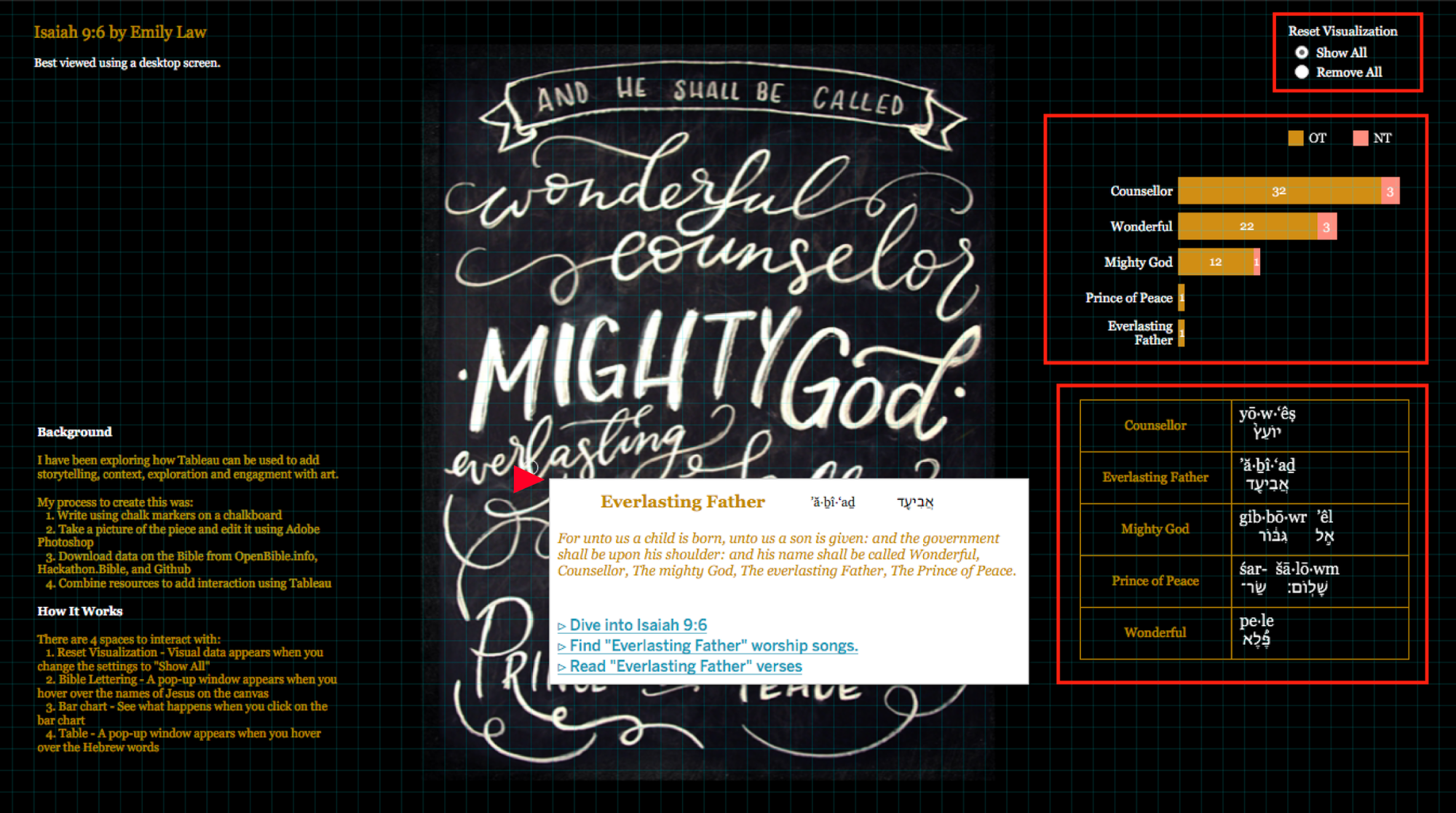
There are 4 spaces to interact with:
- Hovering over the artwork. Each name has a pop-up window that includes links to a study on Isaiah 9:6 and related worship songs.
- In the top-right corner, you can change the visual to “Show all” which will add the data graphics. “Remove all” allows the viewer to just focus on the art.
- A bar chart displays the number of times and the Testament that these names appear in the Bible.
- A table of the English names and their Hebrew translations. Hovering over the transliterated Hebrew word provides a definition and a link for further learning.
Resources
When I was designing this, I looked at what was accessible to me, which was Bible lettering. Bible lettering is a hugely popular way of engaging with the Word through art. I used Tableau to visualize the data because that’s what I know. I don’t know how to code so I did a lot of research finding data sources and reading tutorials on how to integrate paper graphics with Tableau.
Here are some resources I used:
- Hackathon – Compilation of Bible datasets, and databases.
- Github – I downloaded the Bible in csv format and connected it with Tableau
What can people learn from this?
What I created is not perfect and there are things I want to tweak and add. As an artist, I always struggle with feeling that my work is not good enough and there’s room for improvement. I am learning to release it out to the world even when I think it’s imperfect. My hope is that people would look at this, in its imperfect form, and want to dive into the Bible. God is the creator of data, and there are so many things in the Bible that theologians have spent years researching but are not yet visualized. I hope that this inspires people to explore how data visualization can make God and His Word more accessible to people. In my own journey there have been many moments of awe and wonder. I constantly feel like a paleontologist that has discovered a new fossil because data visualization has provided opportunities for the Holy Spirit to reveal the grand mysteries of God’s story and character. It has brought me closer to Him, and it has placed an excitement in me to share that with others.
For those reading this, may you be inspired to create even if you don’t know how to get the end result. I pray that God would inspire you and speak through your works.