Remaking An Influential Cross Reference Visualization
imageTitle
Bible Cross References
imageCaption
Click to view interactive version.
date
Apr 16, 2015
description
When I first began exploring the subject of data visualization, I had no idea how much one piece of data-driven artwork could inspire…
publish
publish
When I first began exploring the subject of data visualization, I had no idea how much one piece of data-driven artwork could inspire me. I had collected a lot of bible-related data by then and was looking for ways to represent it visually. Then, I discovered a wonderfully complex, colorful piece of art with a simple message about the interconnectedness of scripture. It struck me deeply and has led to more ideas, some of which you’ve already seen on this blog, and many others which are yet to be created.

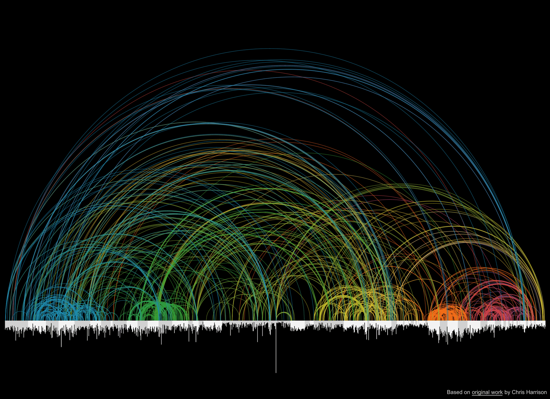
Chris Harrison, in collaboration with Christoph Römhild, developed this visualization to show more than 63,000 cross references. The bars along the bottom indicate the length of each chapter. Colors indicate the distance between chapters. Here’s how he describes it:
We set our sights on […] something more beautiful than functional. At the same time, we wanted something that honored and revealed the complexity of the data at every level –- as one leans in, smaller details should become visible.
Initially I stared at it for days. I glanced at it regularly for a long time after that as it sat on my desktop background. Then, I began thinking of how I could do something similar with my unique perspective and skills.
Variations Large and Small
It seems others have had the same thought. I have seen visualizations which follow similar patterns—some a nearly literal copy, others entirely different in form but similar in content and complexity.

The first two images above are from OpenBible.info which regularly shares popular data visualizations. The third is a project called Similar Diversity connecting words from the holy books of five major religions.
An Interactive Remake
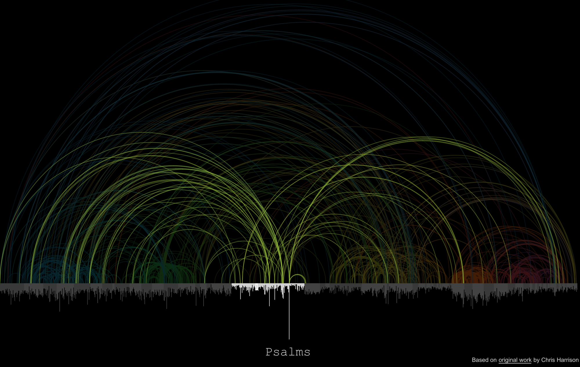
The image at the top of this post links to my interactive remake using Tableau. Click the bars at the bottom to highlight a book as shown here with Psalms.

I felt Mr. Harrison’s original design needed no improvement other than to add clickable highlighting and tooltips where practical. Like the OpenBible.info visualizations, I used R.A. Torrey’s Treasury of Scripture Knowledge to analyze over 340,000 connections.
Handling that much data interactively has its challenges. Tableau can easily query it but cannot efficiently display curved lines for every single verse connection. To address that issue, verse-by-verse connections are rolled up the chapter level, then filtered down to only show the most relevant connections. One other difference between this and Mr. Harrison’s original is the color choice. I colored each line by book rather than textual distance in order to enhance contrast when highlighting.
How Is This Useful?
Clicking through several books has led me to some very helpful insights about how this cross reference data set is put together and the impact it may have on applications which use it. Anyone who has seriously studied the book of Revelation knows it is filled end-to-end with symbols referencing the Old Testament. However, there aren’t many links to those books in this data.The Gospels, though they describe the fulfillments of many messianic prophecies, have few links to prophetic books. Why is that?
Browsing around some other books and going back to the original index by Torrey gives us a clue. Genesis and Psalms cover the span of the Bible because they cover a full range of topics. By contrast, revelation is very specifically apocalyptic and only shows strong connections to end-times passages. And, there’s our answer: R.A. Torrey based his indexing system primarily on the topic of the passages, not on quotations from or specific references to each other. This also explains how there can be hundreds of thousands of links, averaging close to 11 for every verse in the Bible.
Here, visualizing the data has done its job. We may expect to see links between passages based on the kinds of links normally found in modern study Bibles. But, data visualization isn’t always about showing us exactly what we expect. It’s about showing what’s there and sometimes highlighting the unexpected. With this in hand we can refine the data in much the same way God refines us (see 1 John 1) – by shining light on the situation and rooting out what shouldn’t be there.
